SOFTWARE
InDesign
Adobe Photoshop
MY ROLE
Independent Editorial Designer
Publication Designer
Layout Designer
DELIVERABLES
Publication Identity
Magazine Cover Design
Editorial Layout
Feature Article Spread
Photography Integration
TOOLS & CREDITS
Photography provided by Lisa T. (used with permission)
Envato Elements (licensed subscription assets & mockups)
PROJECT OVERVIEW
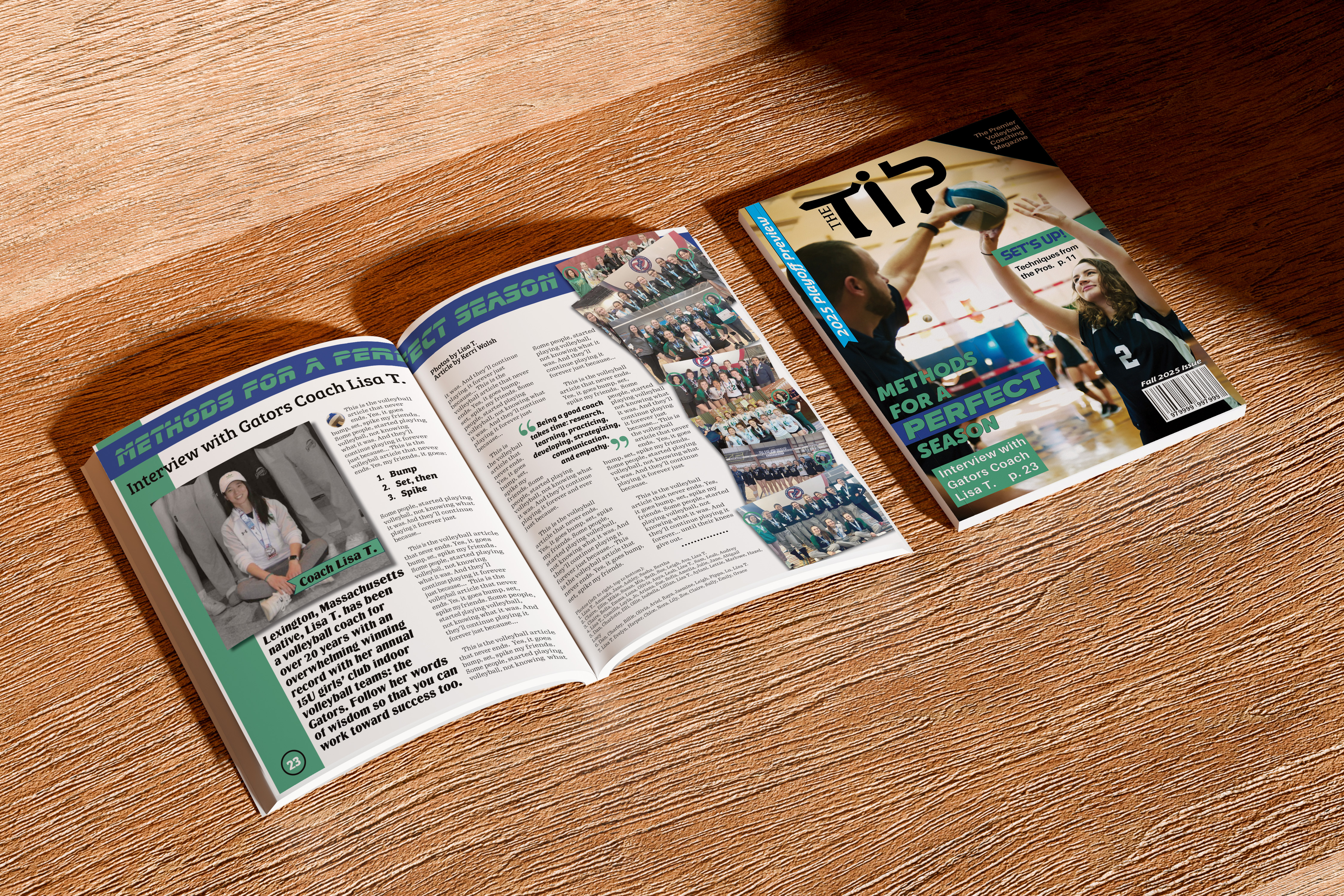
The Tip is a fictional premier volleyball magazine publication created to celebrate the strategy, leadership, and dedication behind competitive volleyball. Designed for coaches, players, and volleyball enthusiasts, the publication explores the stories, techniques, and people who shape the sport.
This project focused on developing a complete editorial identity through magazine cover design, feature article layout, photography integration, and visual storytelling. Using provided photography from volleyball coach Lisa T., the goal was to transform a coaching profile into an engaging publication experience that balances athletic energy with professional editorial structure.
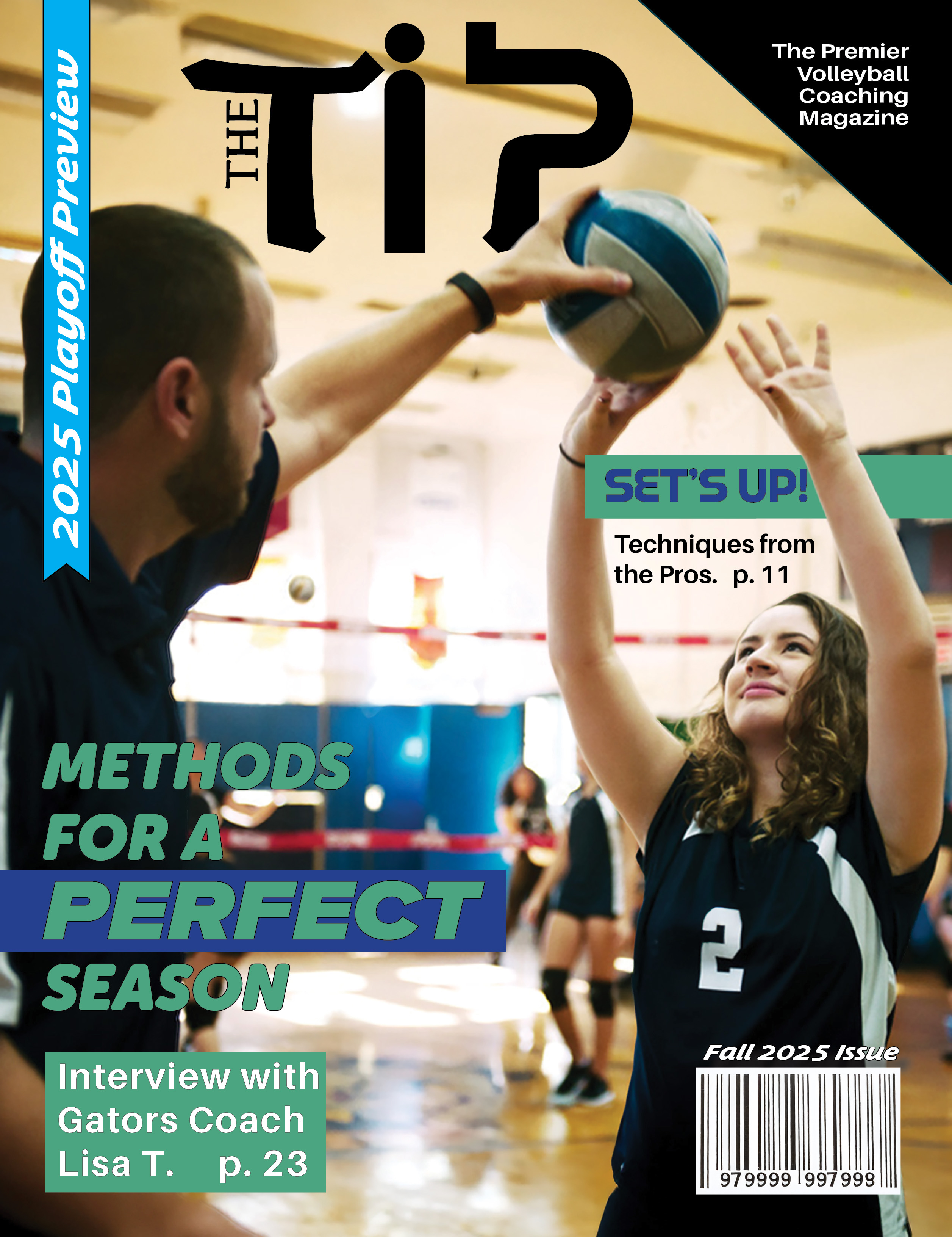
Magazine cover design.
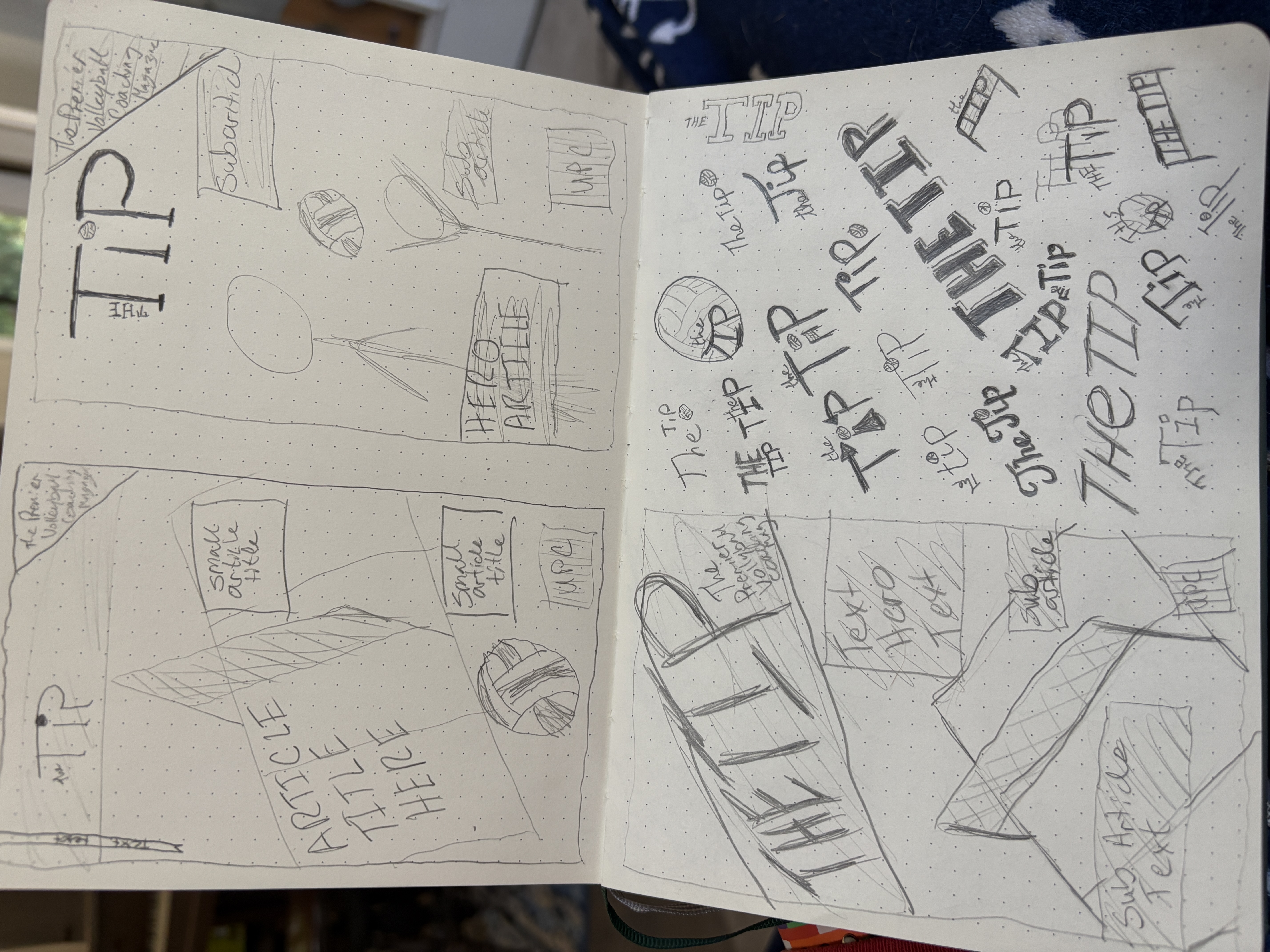
Initial sketch ideas.
CREATIVE DIRECTION
The visual direction combines bold athletic typography, structured layouts, and dynamic photography to create a publication that feels competitive, modern, and informative. The cover establishes a clear hierarchy through feature headlines, issue information, and supporting content, while the interior spread uses grid structure, imagery, pull quotes, and typography to guide readers through the feature story.
The project explores the complete editorial design process, including concept sketches, layout development, photography selection, and final magazine applications.
PROCESS
The project began with the goal of creating a sports-focused editorial piece inspired by my own experience playing volleyball. I wanted to highlight the strategy, dedication, and leadership behind the sport while creating a publication that felt authentic to the volleyball community. After discussing the concept with my friend Lisa T., the subject of the feature, I received her permission and approval to use her photography and share her coaching story.
Using the provided images as the foundation, I developed a magazine concept that balanced athletic energy with a professional editorial structure. The cover, feature spread, and supporting layouts were designed through research, sketching, and experimentation with typography, imagery, and page hierarchy.
To add personality to the article, I incorporated a playful placeholder text inspired by the repetitive structure of the “This Is the Song That Never Ends” song from Lamb Chop, transforming it into a volleyball-themed version that continues throughout the article. Final photo credits were included while intentionally using only Lisa T.’s first name and last initial to protect the privacy of the young athletes she coaches.
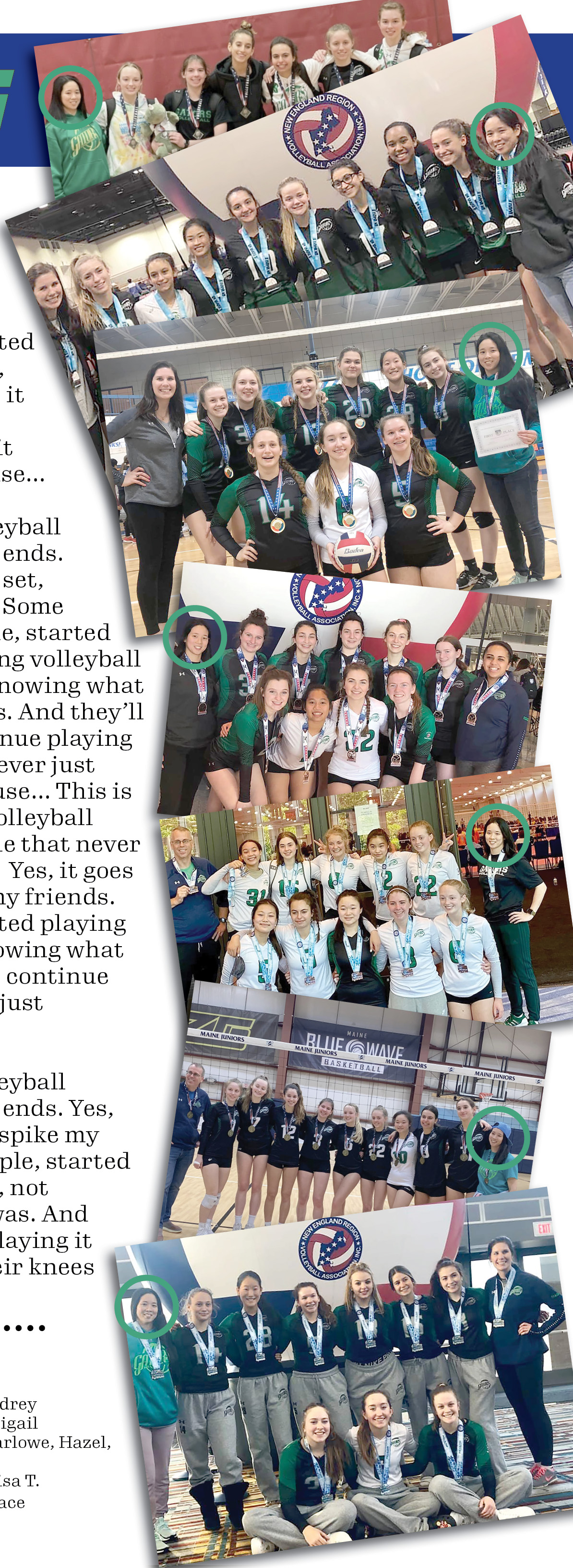
Photography close-up.
GALLERY
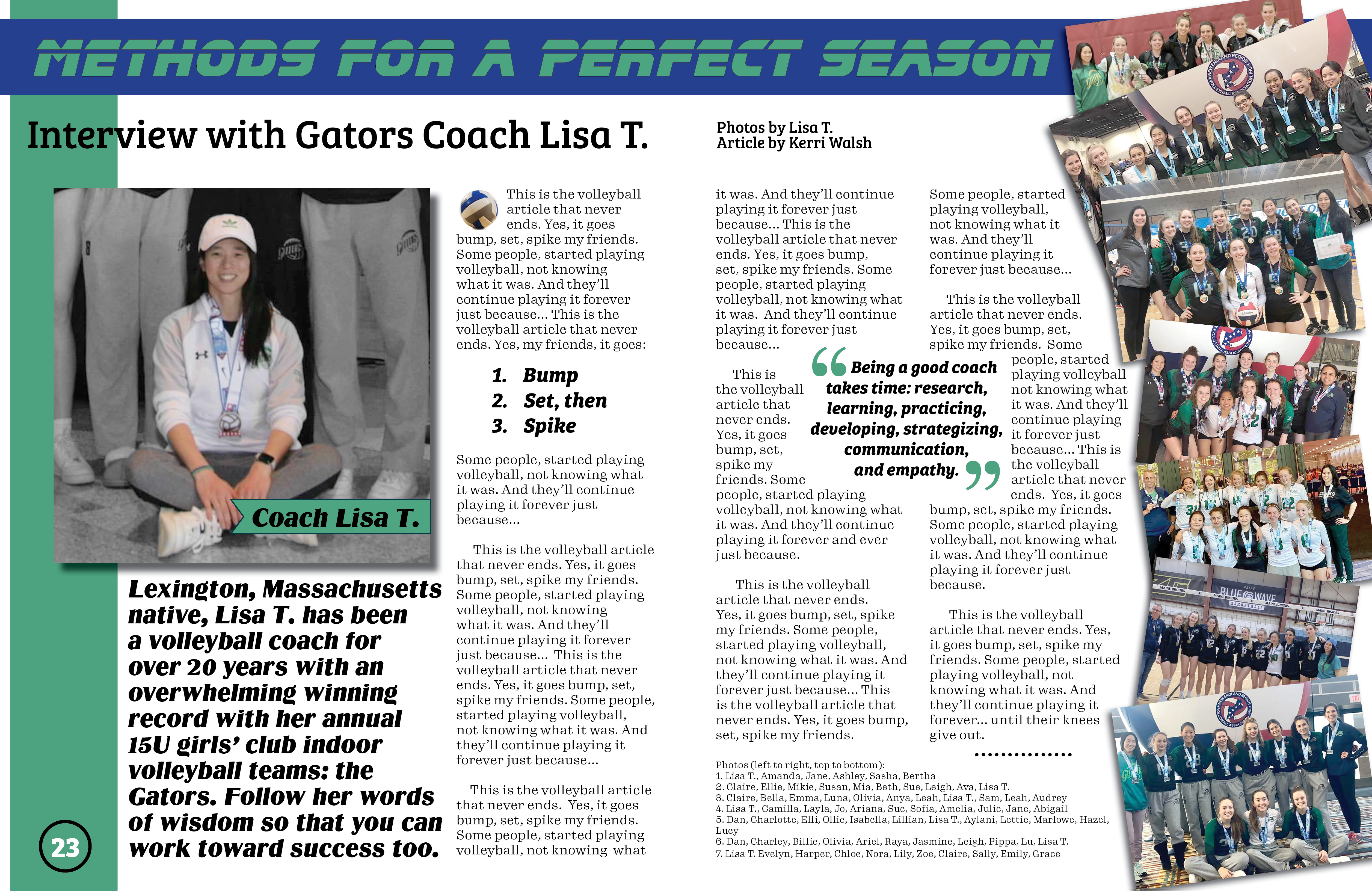
Two-page editorial spread.
Every publication begins with a story worth telling.
CONTACT ME